- client: The Central Union of Agricultural Producers and Forest Owners (MTK)
- industry: interest organization
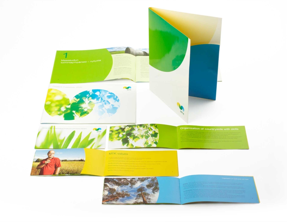
- performance: identity design, brand strategy, brand story
- year: 2007
Three letters that communicate history and tradition – the story of an organization that has always looked after the interests of Finnish farmers. Getting there, however, was not easy. It demanded a lot from us and the customer. But we are both satisfied with the result.
Strong roots
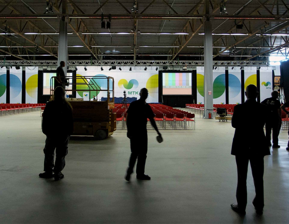
MTK is Finland’s leading trade organization and interest group for farmers, forest owners and rural entrepreneurs. The roots of the organization go deep into the Finnish countryside.
The organization needed a new identity that communicated its dual role as a European lobbying organization and a Finnish interest group.
Back to basics
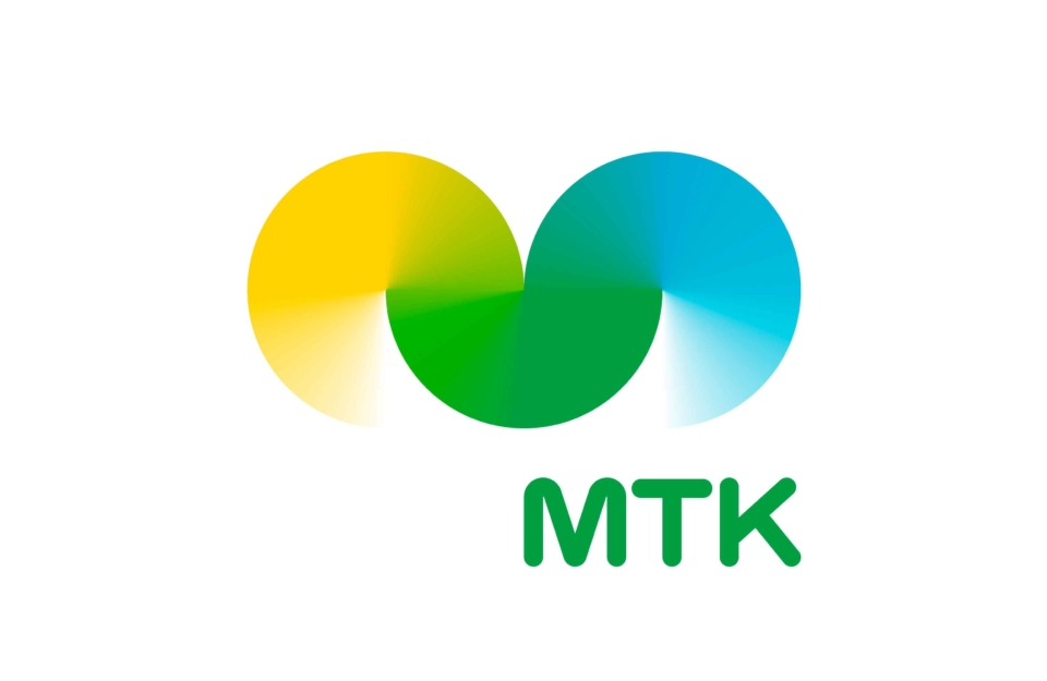
MTK’s new strategy rests on three pillars: agriculture, forest, and rural entrepreneurship. We built on these elements – seamlessly combining yellow, green and blue arcs to form a new logo. Finland’s most famous letters became a story.
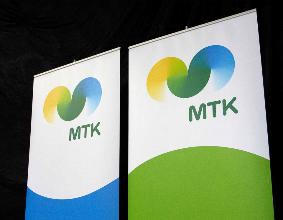
A powerful logo
The new logo helps strengthen MTK’s reputation as one of Finland’s most powerful interest. When you see the logo for the first time, it leaves a lasting impression in your sub consciousness. It communicates a positive and modern image of rural entrepreneurship.